Nav: Country Selection
The Problem
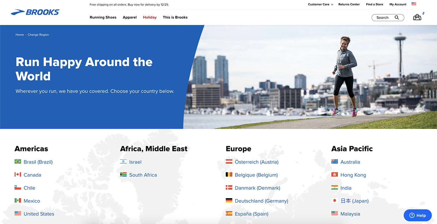
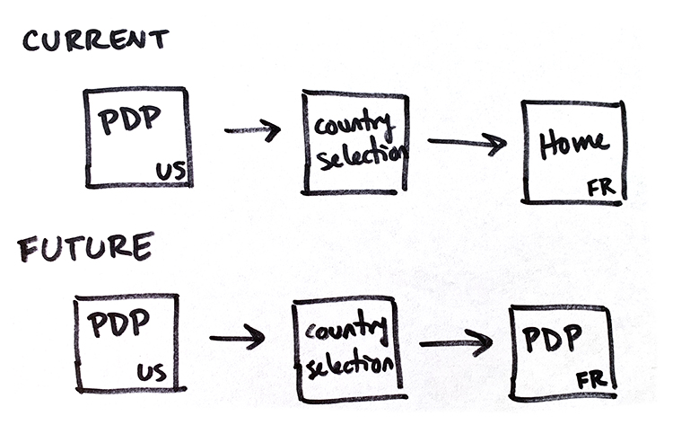
Many of our users in European markets accidentallly land on our US site. After exploring our products, they will come to realize that they are not on the correct site. In order to change to a new country, they click the flag icon in the nav and are taken to a separate page. This page contains links to the various homepages of Brooks' different locales instead of the sister version of the page they were previously viewing.
My Role
I was the design lead on this project and worked on the following areas:
- Research - I performed a small comparitive review of other ecommerce site experiences
- UX Design - High-level user journey strategy. Delivered final design and specs to developers
- Tools: Sketch, Zeplin

Existing Experiences
This journey is somewhat successful in that the consmer is able to reach the correct site. However, they lose their place, causing frustration and high bounce rates.
Due to the lare nature of Brooks' web refresh project, this issue was overlooked during the initial design sprints. Once we started moving into development, addressing this user issue was considered a top priority with a rapid turn around time.

Solution
After my comparative review, looking at other ecommerce site experiences, I sketched out some high level options: drop down selection lists, a pop-up modal, and a slidr-out modal.
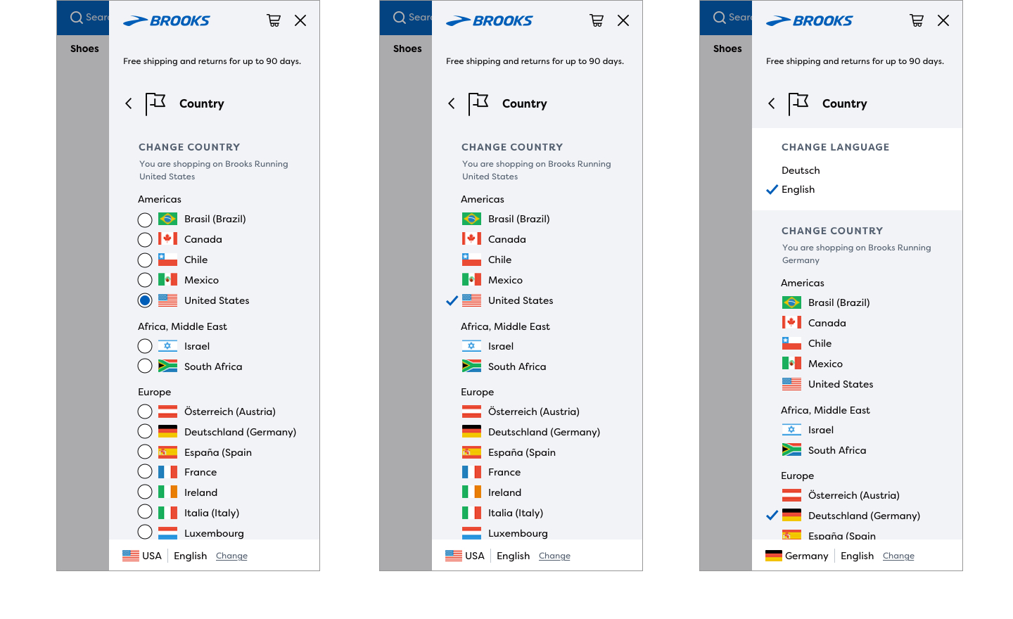
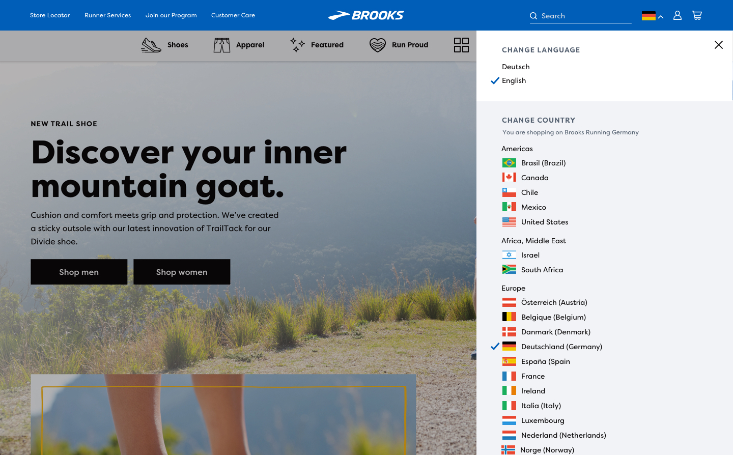
We were currently using a slide out modal to surface search results fron the nav. So I thought it would be a logical step to repeat this pattern for another nav element. There were two major benefits of this solution. 1 - the user could access all the available options without leaving their current page. 2 - developers could reuse the pattern, aleviating some of the pressure of the rapid turn-around time.
The last element was to decide how to show current selections. I experimented with radio buttons but the information looked crowded, busy, and distracting. Instead, I used a simple checkmark to denote which site was in use. This reflected the clean look and feel we were trying to achieve while also making the selection stand out clearly to the user.


