eCommerce Website Redesign
The Problem
Brooks decided to invest in its direct to consumer business by refreshing their ecommerce website, in an effort to proomte a stronger brand presence, improve product presentaion, and better meet user needs.
To achieve this, Brooks partnered with a creative agency to redesign the site from the ground up. Due to the cross-functional nature of this project, a team of about 15 company leaders was established. I was asked to be the UX representative from Brooks, along with a UX consultant we brought on for the project. In addition to us, we partnered with leaders from product marketing, creative, eCommerce, digital products, IT, and customer service.
For this project, we focused on 8 areas of the site: a holistic design system, global elements, search, homepage, landing pages, product category pages, product detail pages, article pages, and an articles "hub."
My Role
I represented both Brooks and the user throughout the year-long effort to redesign the company’s ecommerce website with a vendor. I pushed for using an iterative design process, including testing prototypes with real users, and pressed the team to use both quantitative data and qualitative feedback to guide the work.
- Brooks Design Stakeholder - As the person with the most historical knowledge of the current website's design, I provided necessary information on how the site and subsequent documentation should be designed to meet Brooks' needs
- Brooks User Stakeholder - Also, as one of the people with the most knowledge about our ecommerce users, I was able to advocate for their needs and desires while helping our vendor understand them
- UX Research - Faciitated competitive analyses for every section of the site. Helped develop test plans, watch interviews, and develop key findings
- UX Design - Consulted with the vendor's UX and design team to refine user journeys and final designs. Updated Brooks' design system and documentation to reflect the new designs
- Visual Design - QA'd every design handed from our vendors to our development team to ensure quality and accuracy
- Tools: Adobe Dimension, Photoshop
Rediscovering our Users
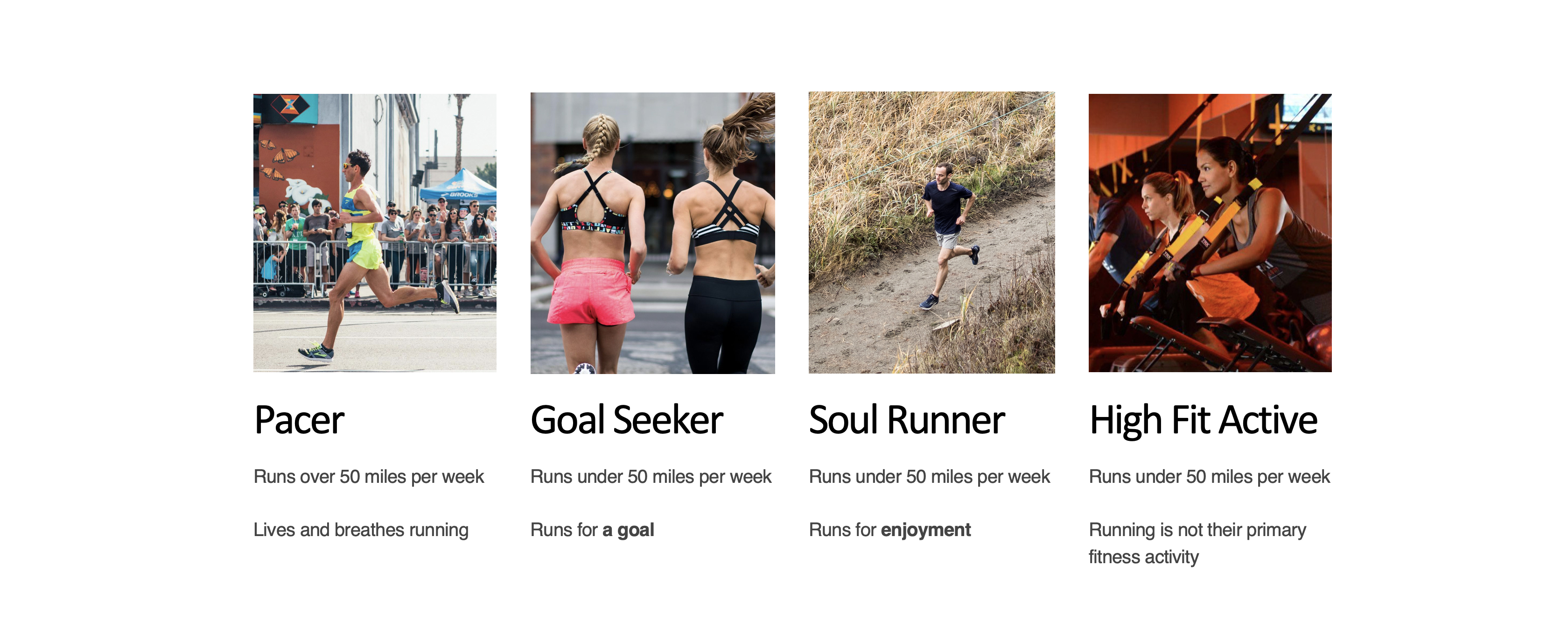
In the initial stages of this project, we needed to define our target user so we looked at Brooks' defined user personas. They were Pacer, Goal Seeker, Soul Runner, and High Fit Active (see image below for more detail).
We discussed the fact that these personas were not relevant to the needs of this project. The company's current personas were created by the marketing department and were focused on the runner's relationship with running rather than their purchase behavior.
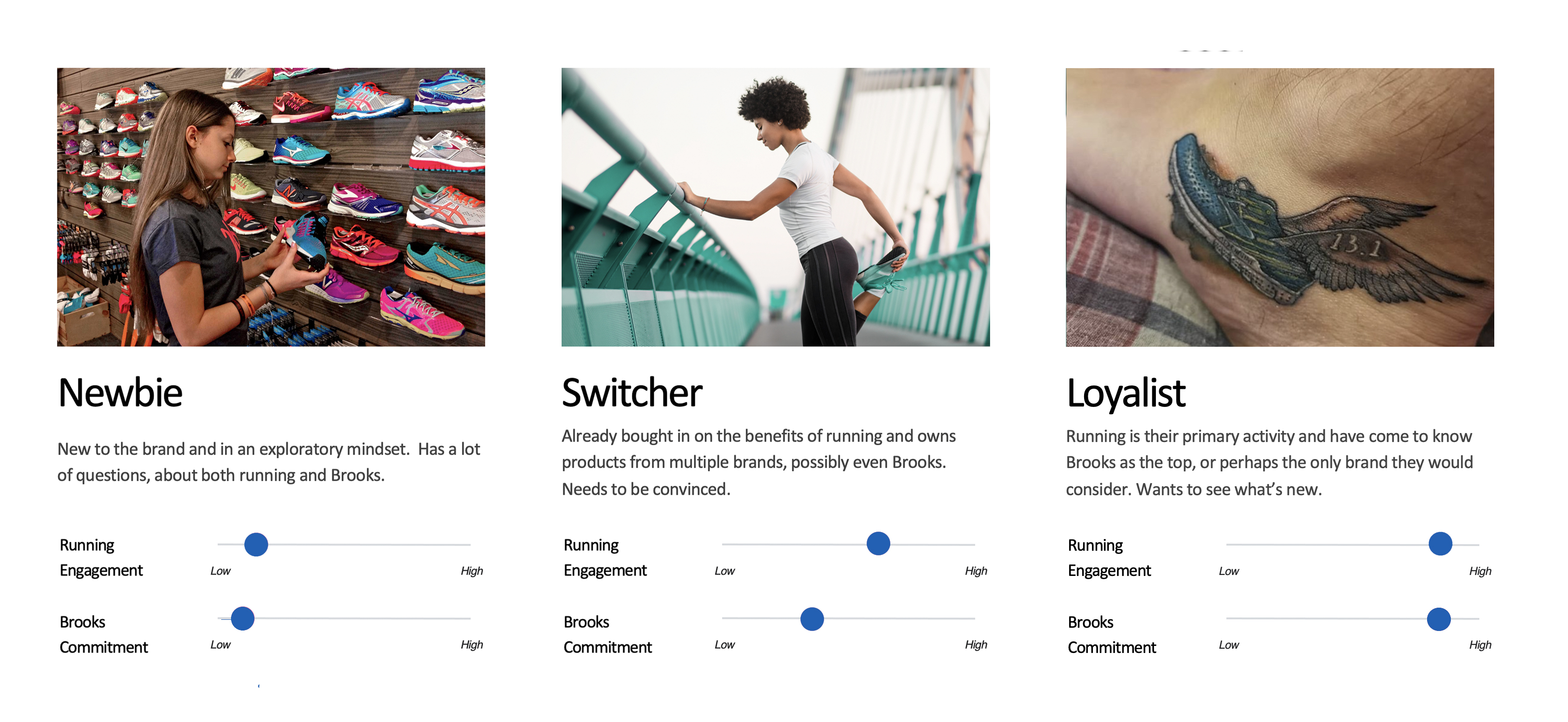
We interviewed 50 runners to understand their motivations. We then established three main personas to represent our users and their purchase behaviors. This was based on their level of engagement with running and their commitment to the brand that they currently wear (see below image). We then definted what each persona says, thinks, feels, does, and needs. 60% of the users we interviewed fell into the 'Switcher' category, someone who is a confident runner but is not loyal to one particular brand or product.
Understanding our Target User
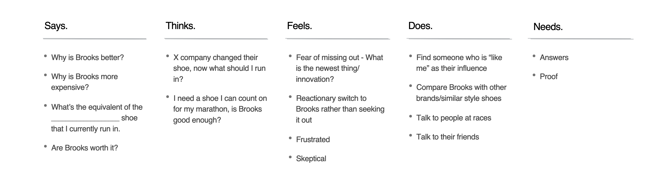
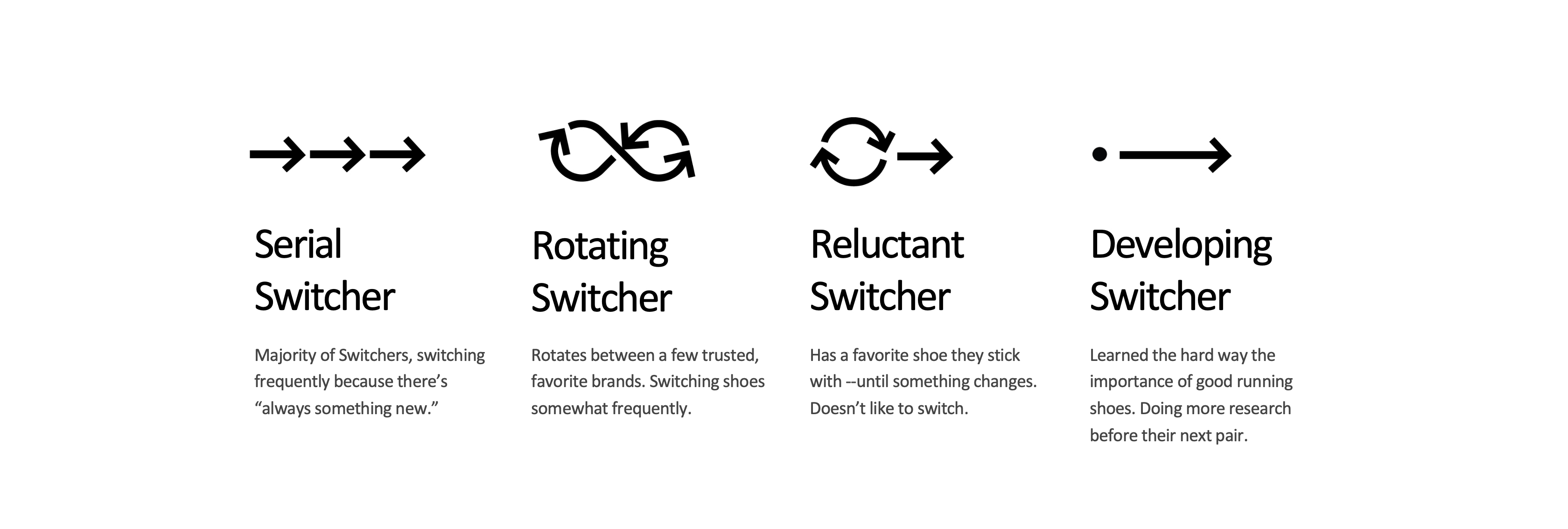
Because over half of our user base fell in the Switcher category, we decided to break that down even further to see if we could get to the heart of why they were switching.
We interviewed another 50 users, asking them probing questions about their motivations. We studied their goals, attitudes, influences, pain points, and brand affinities to be able to understand the why.
We learned that half of our Switchers are constantly switching because they are driven by the idea of trying new products and technology; we labeled them 'Serial Switchers.' Our second largest group was the 'Developing Runner' who is likely to switch because they want to learn what all of their options are.
We used these two groups as our north stars for the entire project. We aligned our goals for the website refresh to match the needs and desires of these user groups. Serial Switchers need high levels of information about technology and what makes the product unique or stand out in the market. Developing Runners need accessible information that is easy to understand and motivating, they need a reason to trust the brand and it's products.
 Updated user personas:
Requirements Gathering
Before we would start a sprint for any one section of the site redesign, relevant stakeholders would meet to discuss and align on requirements for that section.
As a UX stakeholder, I was a part of every initial requirements meeting, detailing expected deliverables, quality standards, and documentation formats. In these meetings, I pushed for the need to perform user testing and an iterative design process which our vendors were initially against. They believed that testing would slow down our progress and posibly hinder us from meeting our timeline goals. My UX consultant and I argued that without engaging the user and listening to their feedback, the entire project would be at risk of failure, no matter how quickly we were able to finish it. After our strong advocation of gathering user data and feedback, we were able to garner support from other stakeholders across the business, ensuring that the user was given a seat at the table during the redesign.
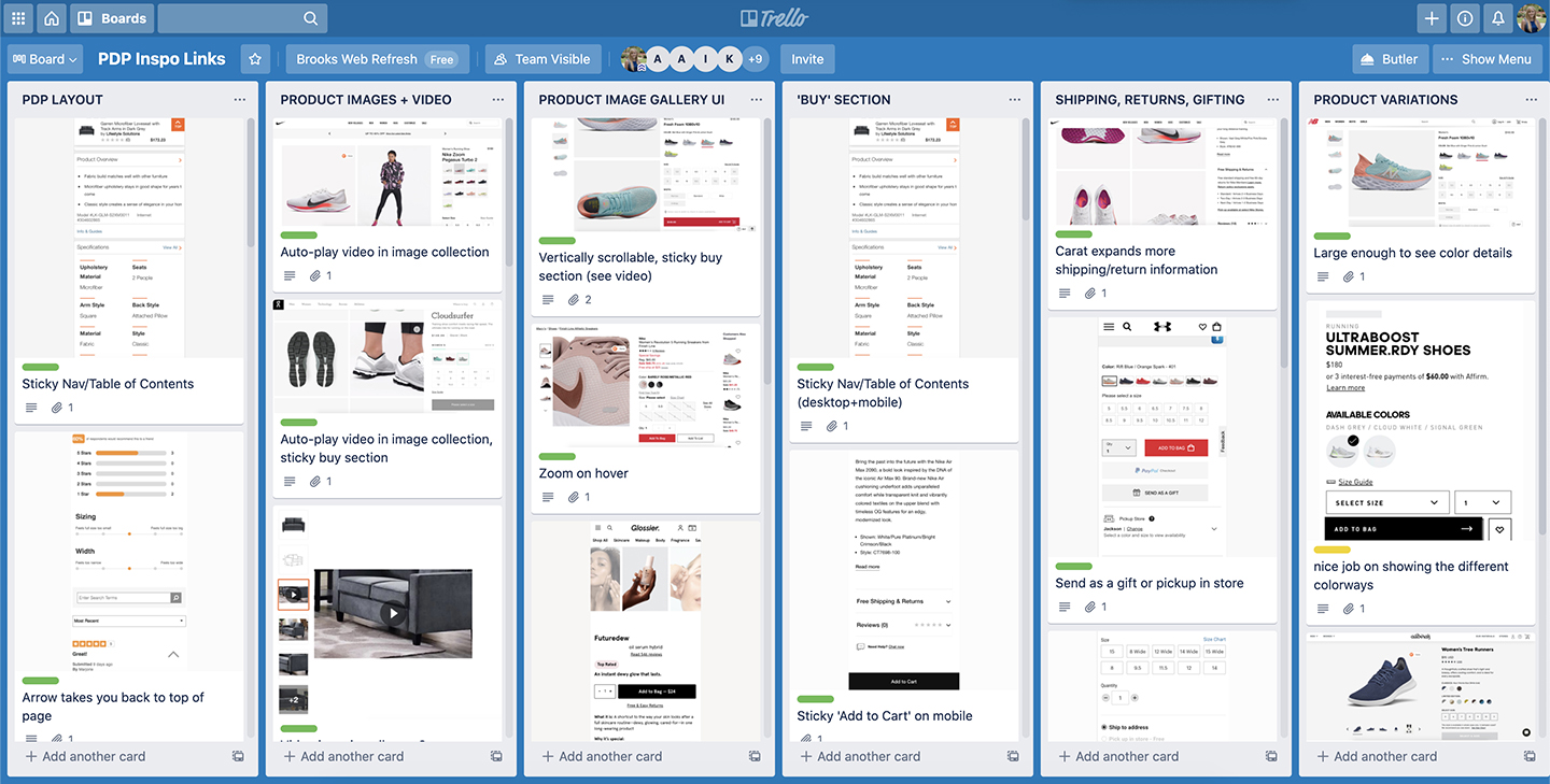
Tisssue Sessions
Before every tissue (kickoff) session, I performed a competitive and comparative review of other sites and applications. I also gathered site examples from other stakeholders and vendor partners to gain a broader perspective, and best practice guidelines from Baymard and Nielsen Norman to make sure we were keeping the user and usability top of mind. I then broke down these examples into specific areas of focus, for example in the screenshot below, product variations, product images, and product gallery UI were all broken up into separate sections for deeper analysis.
After collecting research and performing a competitive analysis, I would then present my findings and facilitate a discussion with the larger group at the start of every kickoff meeting to align on what sites we want to draw inspiration from and which we want to avoid, helping establish guiding principals before starting the rest of the brainstorm sessions.
Design Sprints
We established three week design sprints. This allowed us time to brainstorm together, review wires, design, review, iterate, create and run user tests, incorporate any findings into a new iteration, and then review again, and gain approval from stakeholders.
Before sitting in review meetings with the large group, I would read through the decks and make notes of any feedback I had, thus ensuring that any important notes wouldn't be forgotten or skipped over in the meeting but would be sure to make it back to the revision team. As the sprints wore on, I found this form of feedback to be imperetive because it was easy for tangents to form in such a large group with limited time resources.
Testing
As I mentioned above, my consultant and I fought hard for the inclusion of user research and testing in this process. After the first review, while the visual design team was making updates, we would work with our vendor's UX researcher to establish what questions we wanted answered by users. We would establish problem statements, research objectives, flows, and even specific questions to aid in the creation of the test plans and prototypes.
We observed every test and interview, taking notes and discussing our findings as a group before presenting our recommendations to stakeholders for approval and the design team for updates.
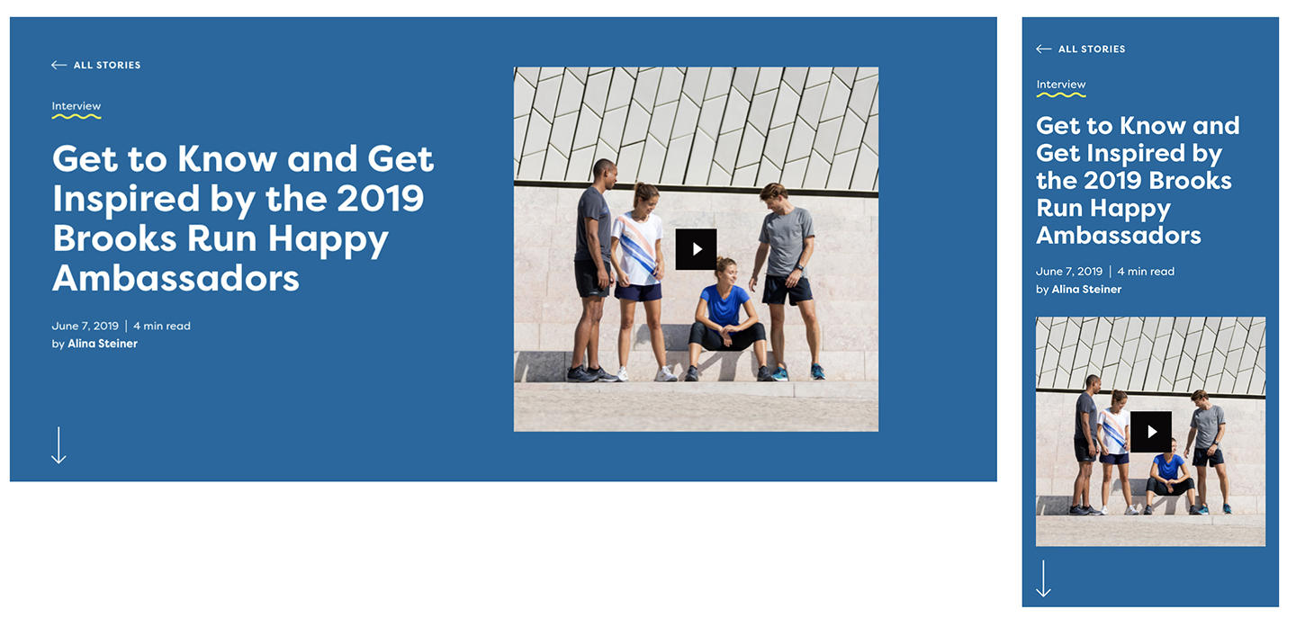
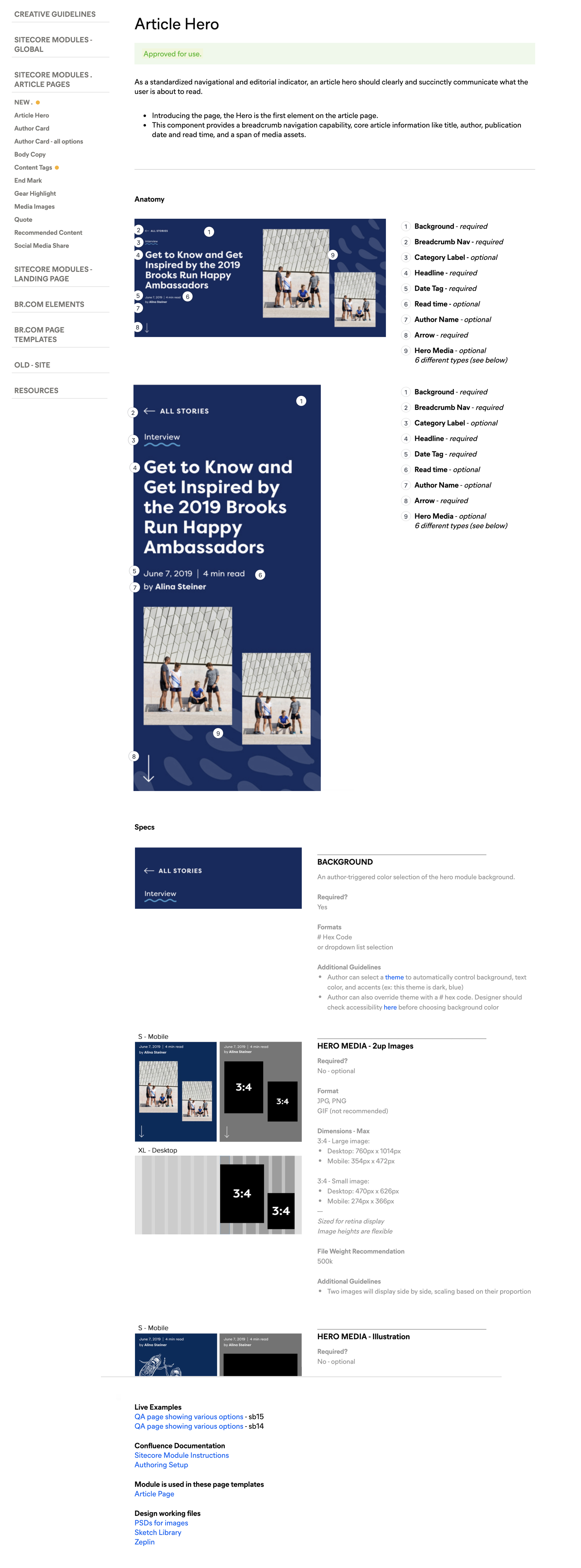
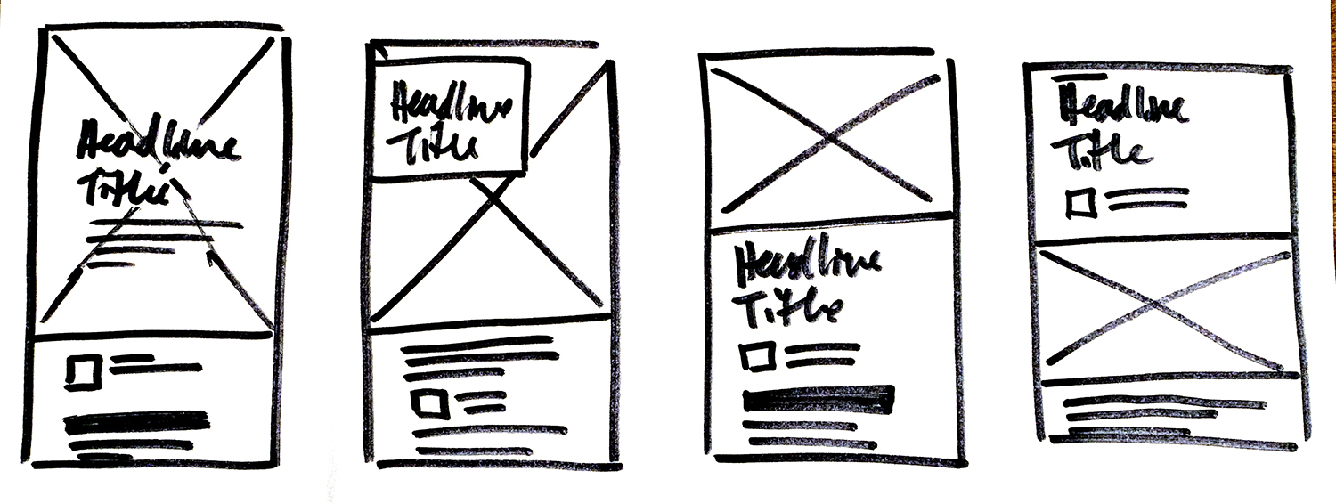 Refined designs for Article Page hero components:
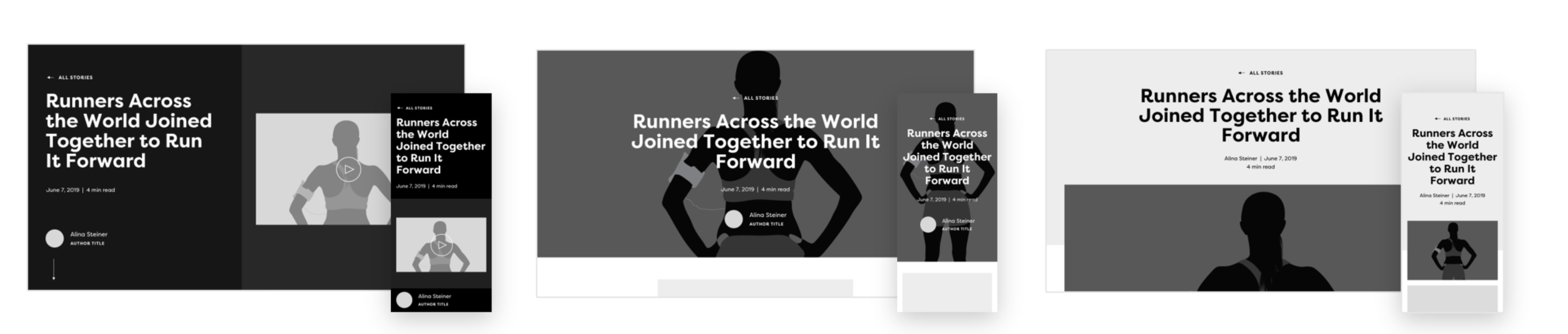 Final designs:
Documentation
As the bridge between Brooks' developers and graphic designers, I take documentation very seriously. The clearer we can be about specs and requirements, the fewer mistakes will be made. Also, the more information the designers have, the more empowered they will feel. I want to give them the autonomy to come up with creative solutions to page design problems.
With each set of deliverables from our vendor, I would analyze the provided documentation closely, ensuring no questions were left unanswered. Then I would add all this information into our design system, create examples, and ensure it was easy to comprehend, even by freelancers unfamiliar with our site.
Design QA
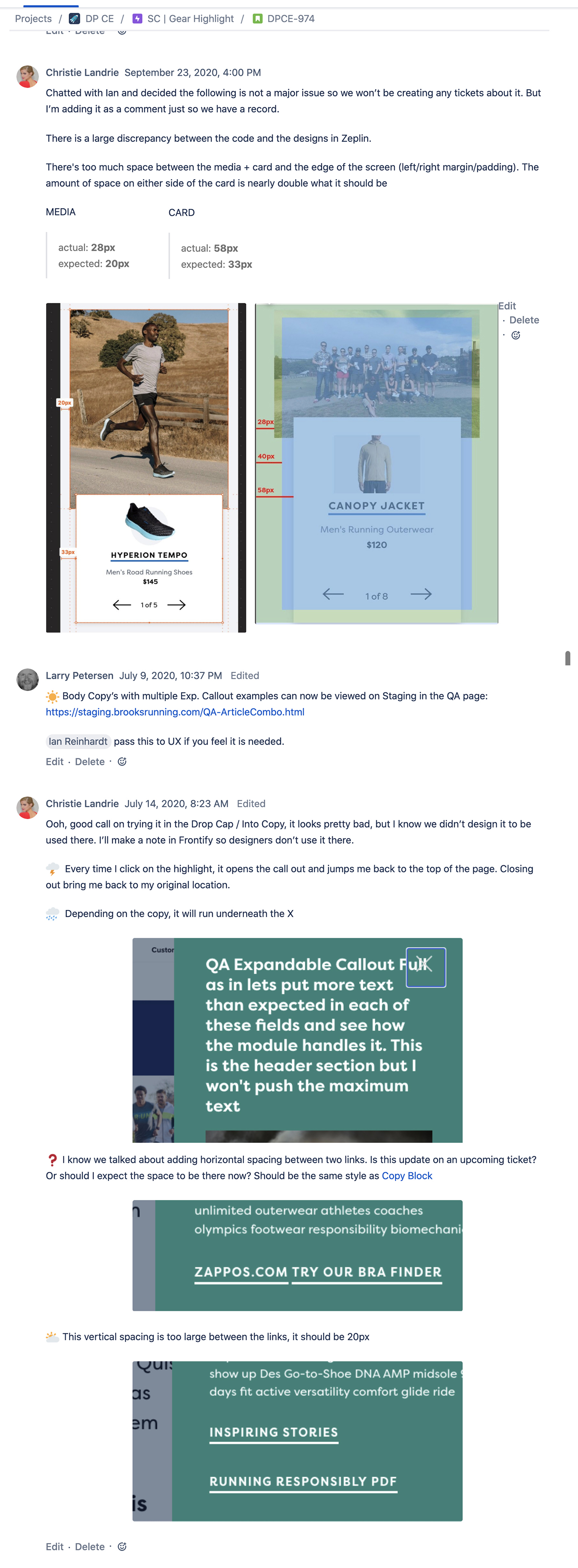
My final role in this process was to serve as a design QA during the development handoff. We had two development migrations. One, the development of the patterns in our library which I would QA against the approved final designs. Once those were aligned, our developers would build the code in our CMS. I would then QA the code to ensure it matched up with our pattern library.
In addition to making sure the designs matched, I would QA the interactions against the stakeholder approval notes and the documentation that we had approved. Once all the code was approved, I would update our design system to alert designers that they coud begin safely incorporating those patterns.