Microsoft TechNet
Problem
Microdoft's new service, TechNet, provides IT professionals with online training tools to advance their careers. It analyzes your current skills, suggest future roles based on your current competencies, and provide educational courses to broaden your skill base.
How can we separate TechNet's Learning Center from it's other offerings? What is the best way to organize the large amount of information and keep it relevant to the user? How can we keep users engaged and encourage them to keep returning?
Role: UX/UI Designer. Transitioned to another company before project was completed/implemented.Skills: SketchSolution
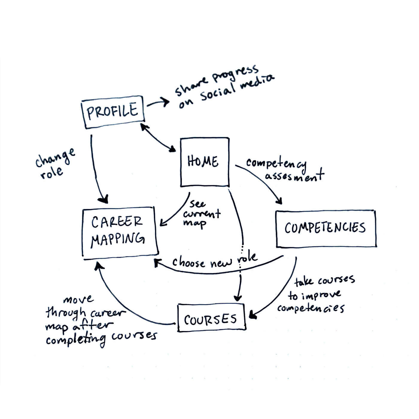
First, I cataloged the different information the learning center wanted to convey. Then I mapped out a basic user flow to understand how all the pieces would work together.
Once I understanding what I was working with, I researched Microsoft's many sites and web portals. I noticed that most of the sites looked the same, great for brand consistency but not ideal for separating information. The TechNet site itself had a vast amount of information and exit paths so we needed to find a solution to make the learning center feel like its own entity.
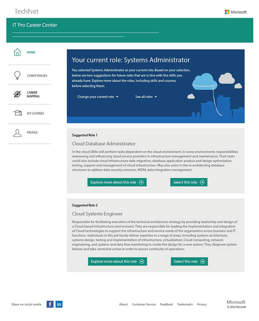
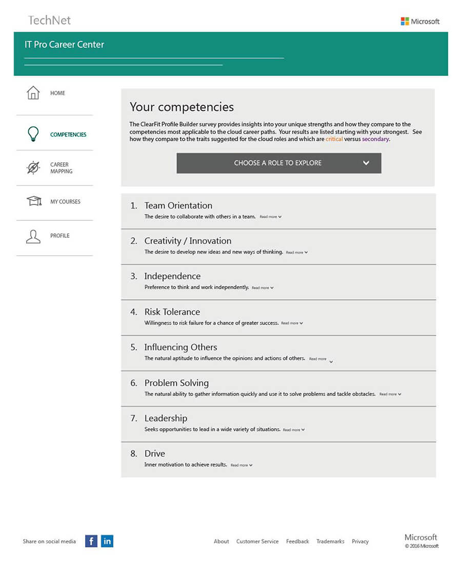
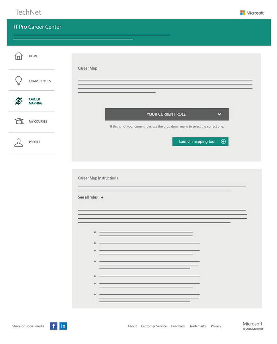
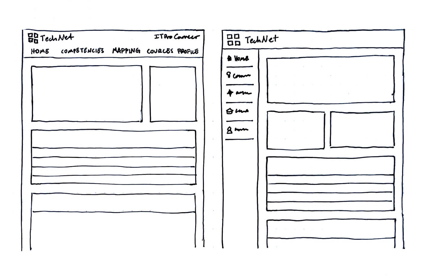
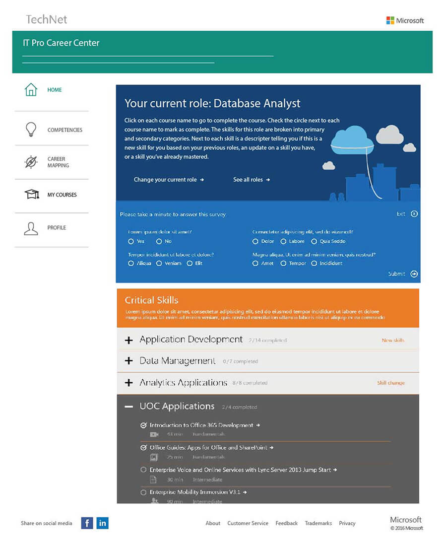
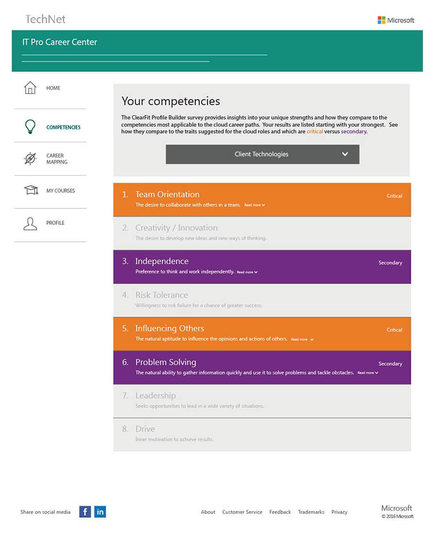
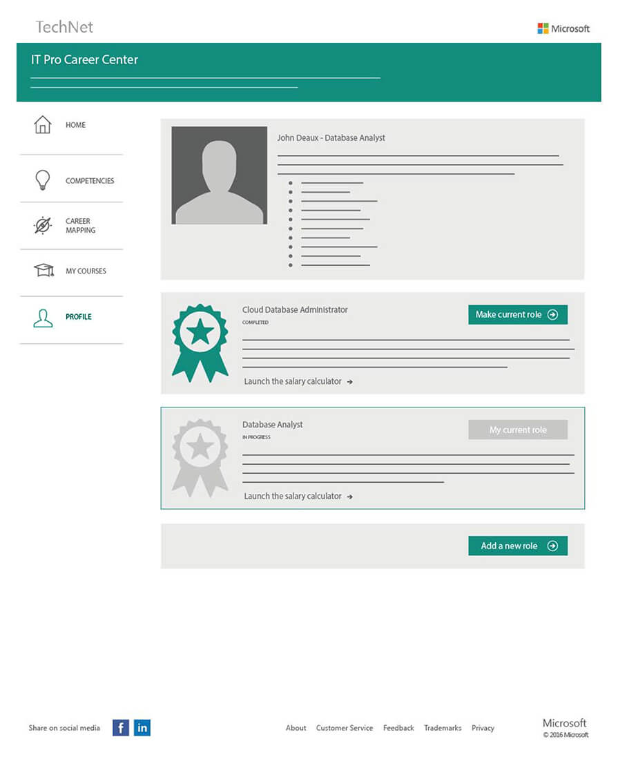
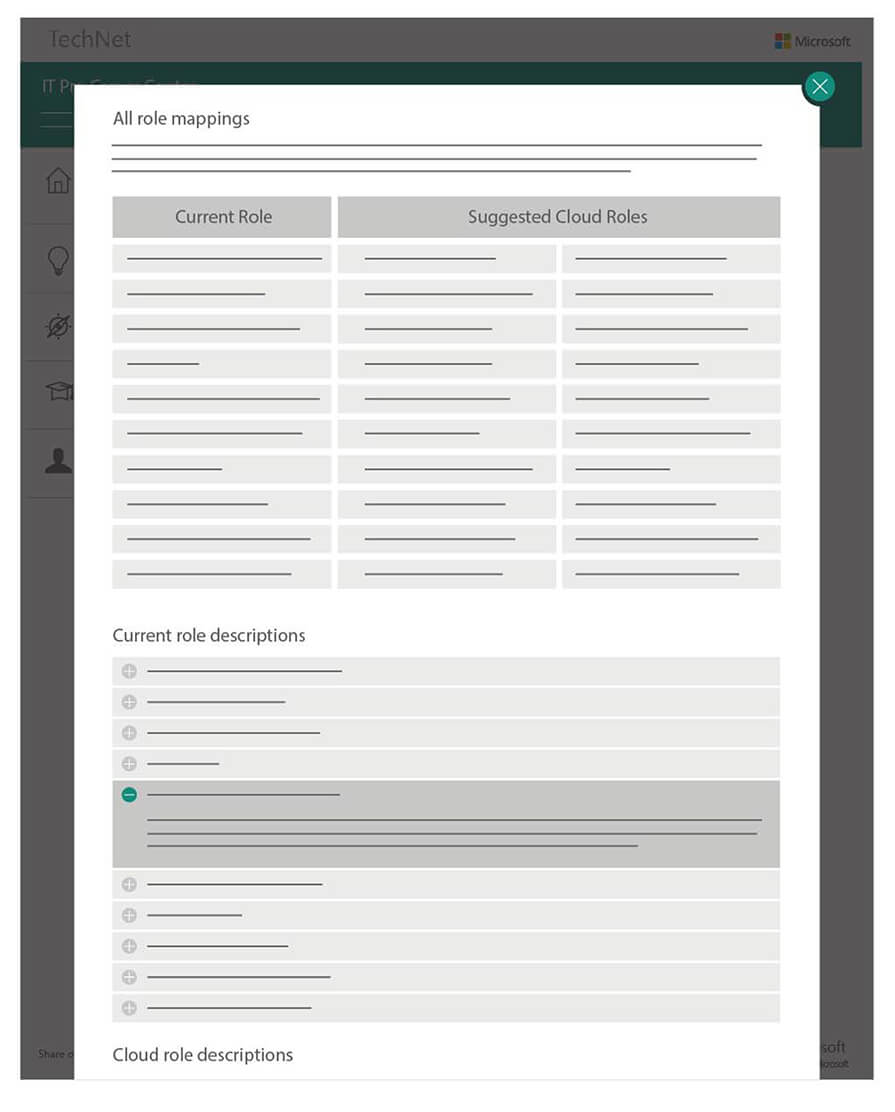
After various wireframe and mockup iterations, our proposed solution was to create a web portal with a left-column nav. This was very different from the main TechNet site but remained on brand with some of Microsoft's other products. Qualitative testing confirmed that the user quickly understood that they had entered a new experience and were intrigued to click around and learn what the portal had to offer.
