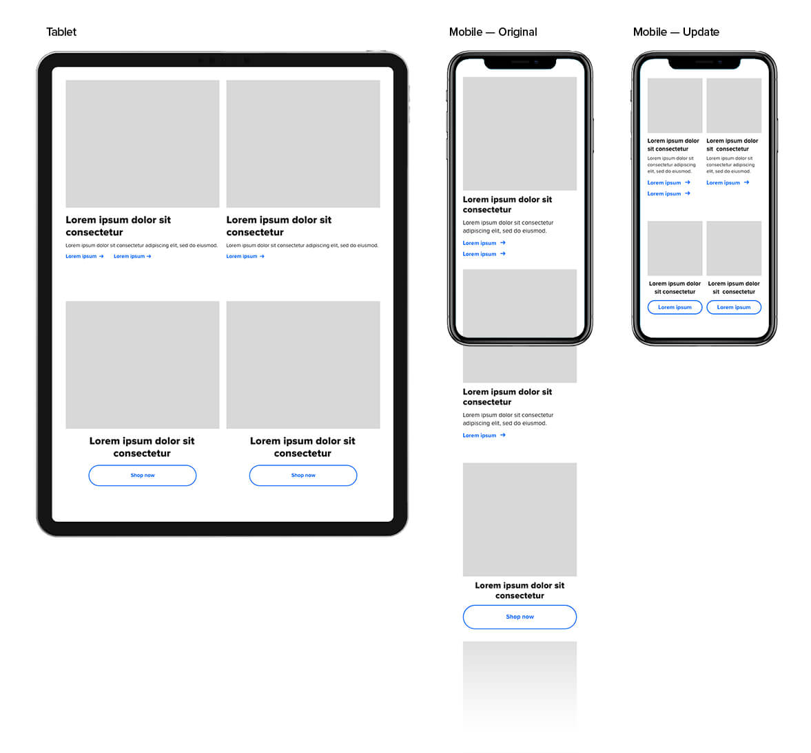
2 Column, Mobile
Problem
With Brooks' current components, users were having difficulty navigating our homepage. Quantitative testing showed that users were not scrolling very far, especially on mobile. They typically exited after one or two scrolls, relying on the navigation to help them through the site.
My goal was to alleviate this overwhelming feeling, I wanted users to land on our site and feel comfortable browsing. The consumer should feel ownership over their browsing experience instead of feeling forced to use the nav because the page they landed on was too much to take in. If they choose to, the user should be able to easily look through our homepage and find what they are looking for—something relevant to them and their shopping/research intentions. The goal was not to serve more content, it was to help the consumer navigate that content.
Role: UX DesignerSkills: Sketch
Solution
After doing a few qualitative tests, we learned one of the main reasons why our consumers weren't scrolling. Users found that every message on our homepage looked 'big and important' and it seemed overwhelming. Our mobile site mainly utilizes one column. Because of this, our 8-10 equally weighted components were too much, making users choose to exit after viewing 3 or 4.
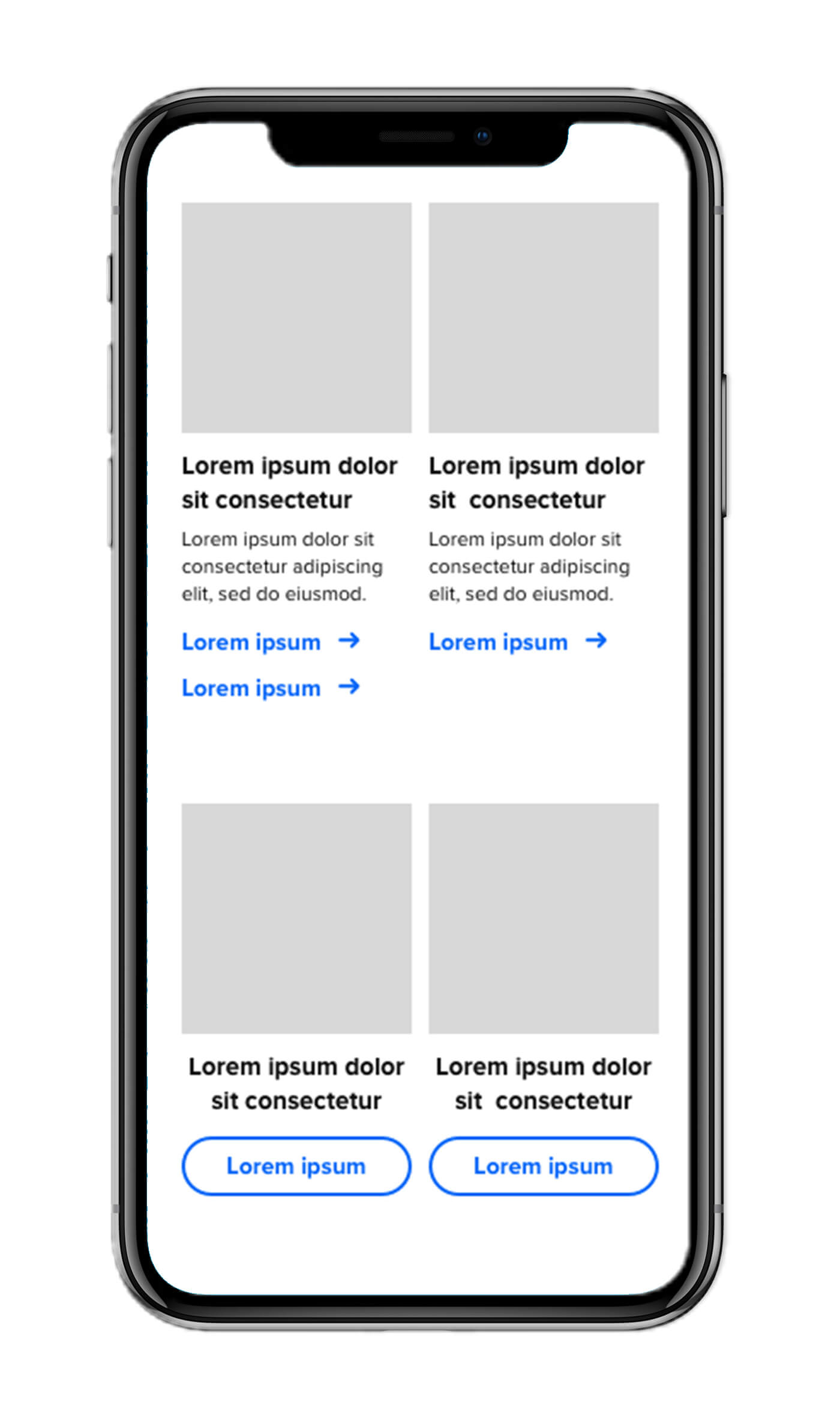
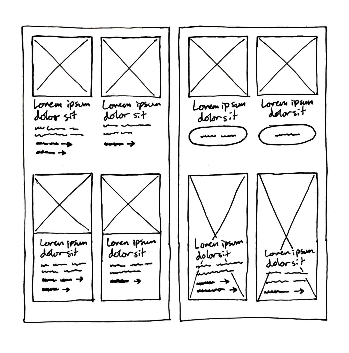
I performed an audit of our existing modules and researched various mobile sites (both ecommerce and other). I brainstormed solutions, looking into optimizing an existing component or creating a new one. Optimizing an existing component was the best solution, both visually and based on development capacity. I was able to reduce the original componemt height by almost half, adding visual heirarchy, and did not sacrifice information.


