Shoppable Moment
The Problem
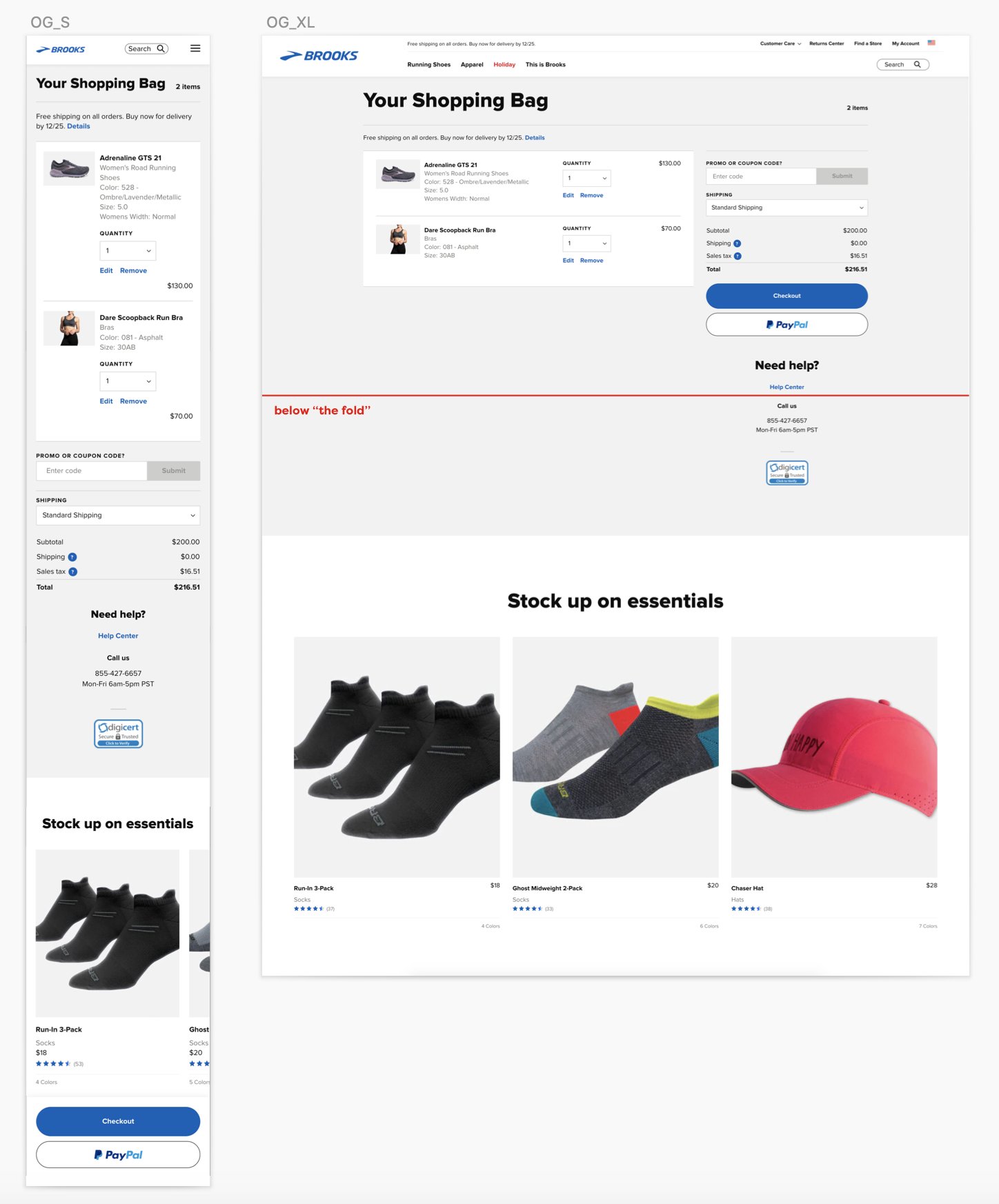
Our live A/B test of recommended products on the cart page was successful however, the content is difficult to discover because it is only visible below the fold. We want to make the module more visible to users without disrupting the checkout experience. We also want to feature more than three products and update the experience to match the new website style.
My Role
I was the design lead on this update and also consulted on the original A/B test. I worked on the following areas:
- UX Design: Researched compatible components and made modifications in order to have them fit in the space and meet our high accessibility standards. Delivered final design and specs to developers
- Tools: Sketch, Zeplin
Existing Experiences
TThe original A/B test was a low level of effort, using a current component with no modifications and placing it at the bottom of the page.
Unfortunately, most users never saw these recommendations because the component was below the fold on desktop and mobile with no visual indication encouraging them to scroll further.

Solution
I did some comparative review, looking closely at other ecommerce sites and researched best practices on Baymard before moving forward with designs.
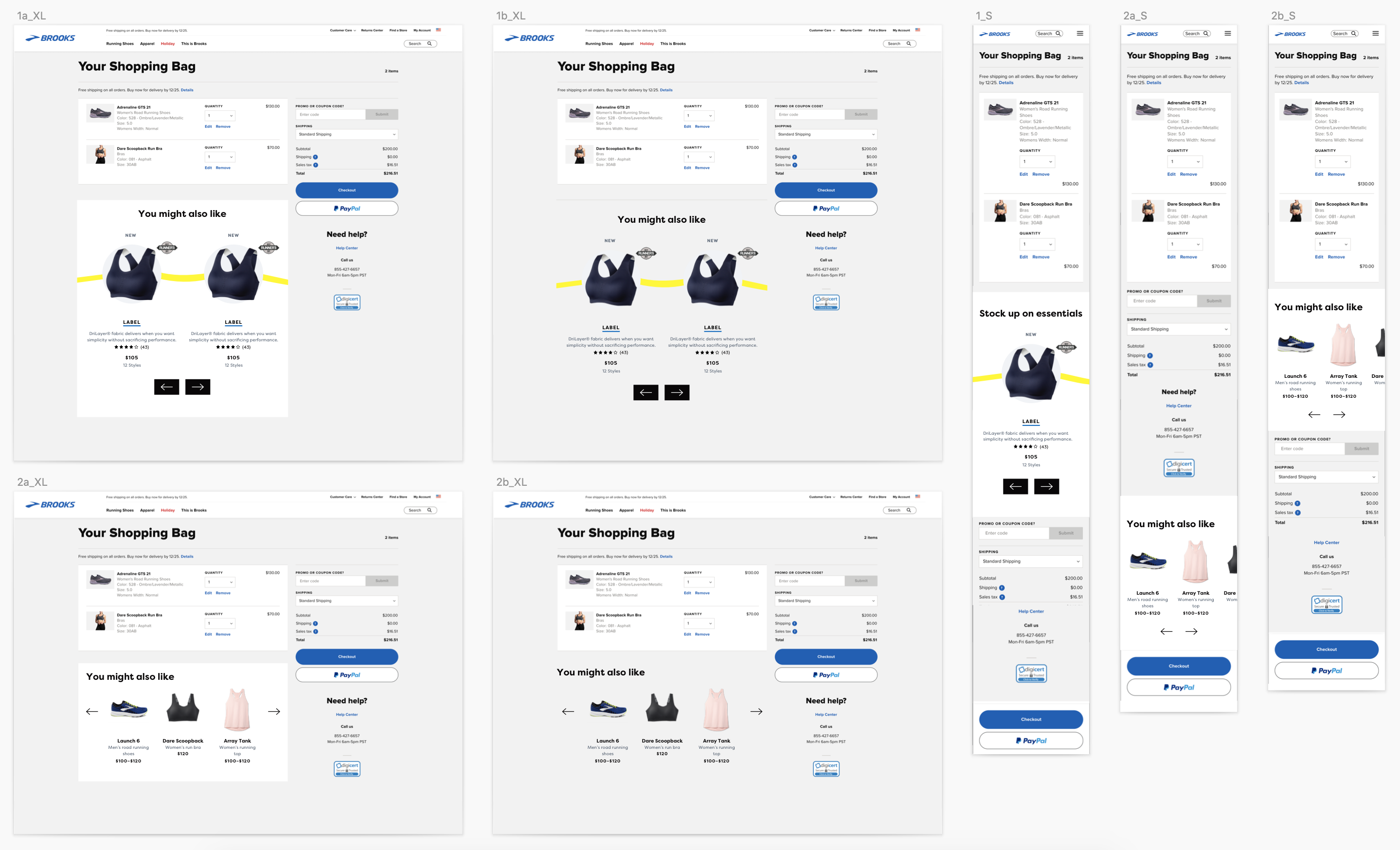
Because this ask had only a small number of development hours allocated to it, I chose not to redesign the page from the ground up. Instead, I decided to simply modify some of our new components and move the recommended products to be in line with the products already in the cart.
We had two carousel components that seemed the most viable for this solution. The first featured very large product images and a bright yellow line which seemed to overpower the page, making the cart products and checkout CTA feel diminished in importance.
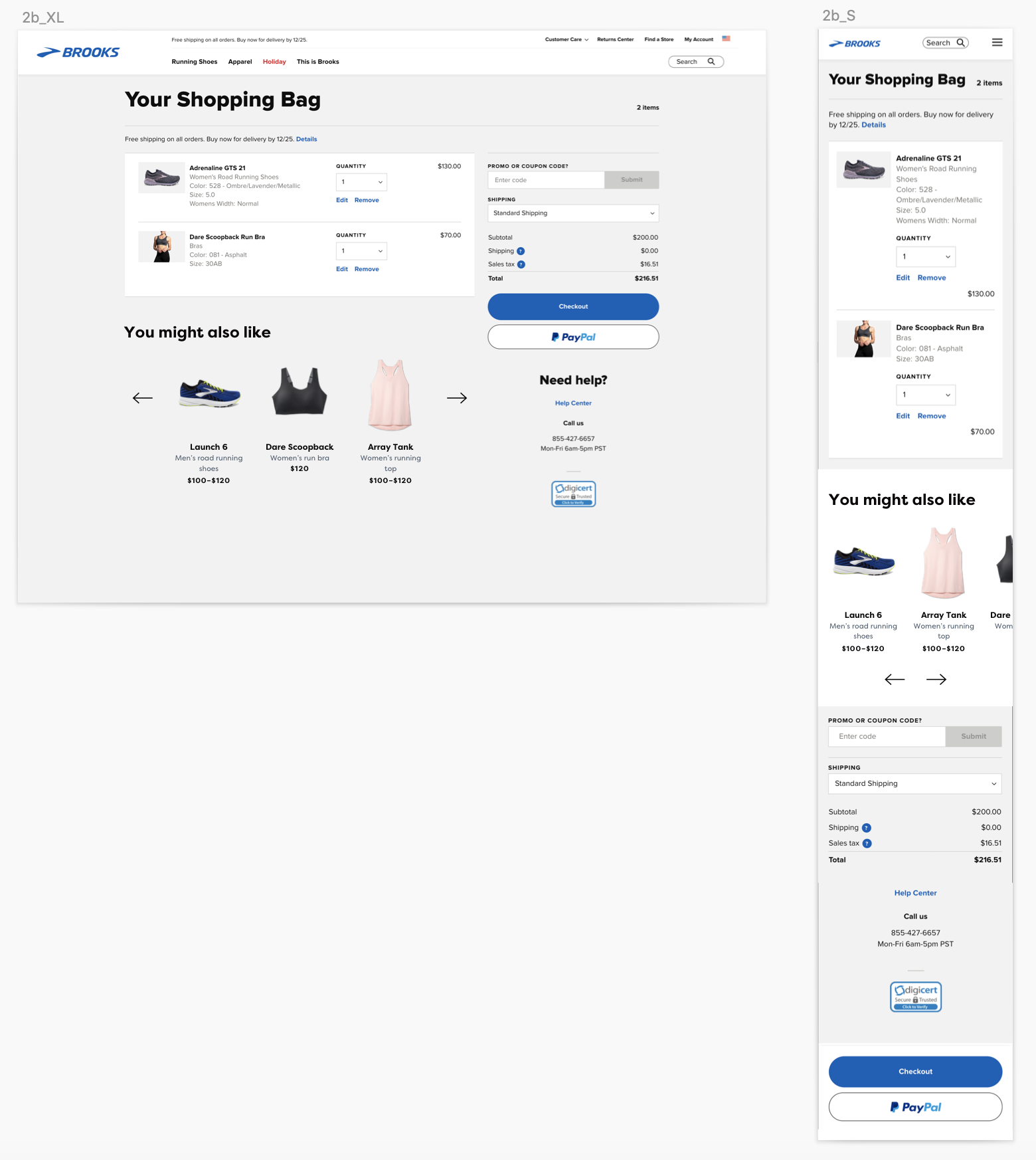
The second carousel component had no distracting line and much smaller images which allowed us to feature three instead of two. However, this component was not accessible because it had no indication that it was scrollable. In order for the user to be able to understand and access the hidden products, I added small arrows (rather than our color-filled arrow buttons) to ensure the component did not feel too heavy and distracting on the page.
 Final designs.
